Even though I may endorse such optical illusions that ONLY imply NSFW content (while in reality being perfectly safe), I still wouldn’t want them showing inside your desktop widgets and gadgets, potentially bringing you in awkward situation of some sort. Thus, I have decided to place this simple, non-related socket illusion (above) to have something to fill your gadget with. Before you start complaining how these might lack taste, I can assure you the illusions they hold work really great! Hope you like what you’re about to see inside this article! Looking forward reading your comments.
 Continue Reading …
 (65 votes)
Vurdlak on November 19, 2011, with 43 Comments
What do Soviet spies, meditating Yogis, random “cool dude” and Johan Lorbeer have in common? Well, it appears each one of them has mastered the skill of levitation! Today another young lady has joined their league. It appears her speech required so much attention and concentration she didn’t even notice when she got her carpet rise off of ground. Simply amazing!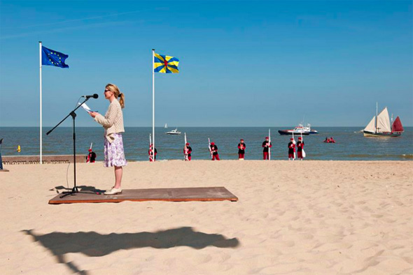
 (87 votes)
Vurdlak on November 16, 2011, with 14 Comments
 As it has been confirmed over and over again, sometimes there is much more to the eye than you can initially perceive. This specially goes for the items that have been featured on Mighty Optical Illusions
website. Today’s featured artist comes from Ukraine, and is widely
recognized because of his illusory oil paintings. His name is Oleg
Shuplyak. The gallery you’re about to see hides a surreal world once you
take a look at it more closely. Through carefully placed objects,
characters, coloring and shadows, there is a second image in the
painting which creates an optical illusion.
As it has been confirmed over and over again, sometimes there is much more to the eye than you can initially perceive. This specially goes for the items that have been featured on Mighty Optical Illusions
website. Today’s featured artist comes from Ukraine, and is widely
recognized because of his illusory oil paintings. His name is Oleg
Shuplyak. The gallery you’re about to see hides a surreal world once you
take a look at it more closely. Through carefully placed objects,
characters, coloring and shadows, there is a second image in the
painting which creates an optical illusion.I’m not sure whether this artist was more influenced by Sandro Del Prete’s opus or works done by famous Octavio Ocampo, but those of you following this website for some time will immediately notice the resemblance! Just like Sandro, Oleg’s works usually feature a portrait of famous personalities. Go through the gallery below and see how many of them can you recognize. Van Gogh, Sigmund Freud and Salvador Dali are just few among dozens.
With works like these, it’s sometimes hard for the author to balance the weight of both images. Personally, I’m more fond of illusions where the “constructed”, 2nd image is more subtile. Oleg on the other hand, does quite opposite – The second image is so easily observable in some paintings, that you can actually miss the first one consisting of harmless landscape or characters in different settings. What you have to do then, is observe the painting more closely to actually see the initial setting and not concentrate on the faces. True skill of such artist is then evaluated by the fact how well did he construct the illusion, and whether the parts of landscapes constructing the illusion have useful part in the original setting. Artists often trap themselves by forcefully adding elements needed to construct the illusion, which don’t actually play their part well in the original setting. In my opinion, Oleg has mastered the technique just like Sandro did, and each part in his paintings seamlessly works in both images, the first “apparent” one, as well as the “hidden” illusory one. So, how many faces did you recognize? Which of his paintings did you like the most?
 Continue Reading … (57 votes)
Vurdlak on November 14, 2011, with 18 Comments
James Thomas Fields has created a very strong optical illusion effect, which gives the illusion of appearing and disappearing spiral lines. Just look at the pattern James originally shared via our FB channel. First time you look at it, there is a big chance you won’t go into details. Now if someone hid the picture
from you after a moment and asked from you to describe what you have
just seen moments ago, your answer would probably end up something like
this – “I think it showed a spiral that narrowed down to a central white spot. At the same time the spiral was covered with some kind of ying-and-yang
overlaying pattern.” Even though not far from truth, the real deal is
that there were no actual spirals present at all! Now if you look at the
picture once again, and try and focus on the seemingly present spiral lines, you’ll soon discover there really aren’t any… Good job James! (50 votes)
Vurdlak on November 12, 2011, with 32 Comments
Here’s a disturbing photo-manipulation that has been circulating Facebook
for some time now. I couldn’t ignore all the requests for it to be
featured no more. It’s like more than a dozen of you have submitted it
to me over the last week. At first I wasn’t that impressed, but as I
kept re-checking the pic each time someone re-sent it to me, finally
have I seen the illusion! Even-though this photo has been heavily manipulated, the illusion stands perfect! So, what do you make of it? Do you see the man standing sideways (profile), or do you see it as a partial frontal shot (a portrait)? It works both ways! Perhaps them police officers in charge of taking mug-shots of criminals could re-think their practice and go with this new approach to save film :D Something similar
we have already featured before, but this one works much better, I
think! BTW another take on this illusion can be seen inside this article
(if you read this off of homepage). Continue Reading … (65 votes)
Vurdlak on November 9, 2011, with 37 Comments
Before I begin with today’s optical illusion, let me ask you
something that has been over my head for the last couple of days. Those
of you familiar with our Chrome plugin
(one that features daily optical illusions in your Chrome browser),
might actually provide me with needed information. It seems as of
recently (for the last couple of days, to be precise) people started
downloading the plugin like crazy. Don’t get me wrong, there’s nothing
wrong with it – it’s just that I noticed huge spike in installs, which I
can’t explain. I suspect the plugin was featured or recommended
somewhere, yet I can’t seem to learn where. So my question is this: if
you found this site in the last couple of days through our chrome
plugin, can you share where did you learn of it before you installed it?
How did you stumble upon our “Optical Illusion of The Day” Chrome plugin? Did you saw it featured somewhere like Chrome Store homepage or something? This info would really help!Onto the illusion now! The strange Atomium-like impossible object below was created by Pawel Hynek in 2006. I bet you would have hard time constructing something similar on your own! After a while you get used to the idea this thing can’t exist on it’s own, and how it was probably brought to life in digital environment. Never the less, I admire the hyper-realistic result Pawel achieved. Does it remind you of a famous Brussels Atomium monument (this one)? BTW: The Atomium monument was originally built for Expo ’58 (1958 Brussels World’s Fair). Designed by André Waterkeyn, the monument consists of nine steel spheres connected so that the whole forms the shape of a unit cell of an iron crystal magnified 165 billion times!! The sculpture stands 102 meters (335 ft) tall.
 (69 votes)
Vurdlak on November 8, 2011, with 12 Comments
 Here
and then I feel like having a burden of “responsibility”, where I
remind myself it would be irresponsible if I didn’t al least provide occasional education,
specially when there are so many young-ones among us, whose minds are
still forming and thirsty for knowledge! Before I explain the science
behind this interesting phenomenon called Troxler’s Effect, let
me show you an example you can experience yourself! Look at the blurry
image on your right. Now stare at the center of the image, and at the
same time try not to blink. After a moment or two, image will disappear,
thus showing you how this article would look like if there was no image
attached to it!
Here
and then I feel like having a burden of “responsibility”, where I
remind myself it would be irresponsible if I didn’t al least provide occasional education,
specially when there are so many young-ones among us, whose minds are
still forming and thirsty for knowledge! Before I explain the science
behind this interesting phenomenon called Troxler’s Effect, let
me show you an example you can experience yourself! Look at the blurry
image on your right. Now stare at the center of the image, and at the
same time try not to blink. After a moment or two, image will disappear,
thus showing you how this article would look like if there was no image
attached to it!Now let’s try and explain the science behind this: Troxler’s Fading or Troxler’s Effect is a phenomenon of visual perception you have just experienced moments ago. When one fixates a particular point, after about 20 seconds or so, a stimulus away from the fixation point (in peripheral vision) will fade away and disappear. The effect is enhanced if the stimulus is small, of low contrast, or blurred. It works best the further the stimulus is away from the fixation point.
Troxler’s fading was first discovered by Ignaz Paul Vital Troxler, back in 1804. It is part of the general principle in sensory systems that an unvarying stimulus soon disappears from our awareness. Here’s a fun experiment you can try yourself: place a small piece of paper on the inside of your forearm. You can feel it for a few seconds, but then the sensation is no longer present. This is because the tactile neurons have adapted. Now, if you jiggle your arm up and down, giving varying stimulation, you will continue to feel the paper until it falls off! Similar fading can be seen of a fixated stimulus when its retinal image is made stationary on the retina, a stabilized retinal image. One can induce an afterimage, usually by an intense, brief flash, such as when one is photographed using a photographic flash.

This causes an image to be bleached onto the retina by the strong adaptation of the rods and cones. In all these cases, the stimulus fades away after a short time and disappears. Troxler’s fading can occur without any extraordinary stabilization of the retinal image in peripheral vision because the neurons in the visual system beyond the rods and cones have large receptive fields. This means that the small, involuntary eye movements made when fixating something fail to move the stimulus onto a new cell’s receptive field, giving unvarying stimulation. One of the more famous examples we covered in the past was Lilac Chaser. Be sure to check Disappearing Effect category for many more examples of Troxler’s Effect!
(52 votes)
Jill Harness on November 6, 2011, with 26 Comments
 We’ve
all taken trips down memory lane, but rarely does that involve an
actual lane and memories of other people like the University of
Florida’s UF, Then & Now project. The concept involves using photographs
of people taken from throughout the last 100 years, by lining them up
with the place they were taken and then taking another image to capture
the changes between the time periods.
We’ve
all taken trips down memory lane, but rarely does that involve an
actual lane and memories of other people like the University of
Florida’s UF, Then & Now project. The concept involves using photographs
of people taken from throughout the last 100 years, by lining them up
with the place they were taken and then taking another image to capture
the changes between the time periods.In the end, the images are not only a great way to document all the ways the school has changed in the last century, but also to thank the students, faculty and administrators who allowed it to grow. For many of the people pictured, it might also be the only way they can visit their Alma Mater during Homecoming season one last time.
While the project is of particular interest to those with ties to UF, I think we can all appreciate the artistic merits of the photos…even if they aren’t technically illusions. For more pictures and information on how the school has changed over the years, be sure to visit the homepage of the UF, Then & Now project.
 Continue Reading …

No comments:
Post a Comment